# scope of work: rebranding / logo design / corporate identity / print / website
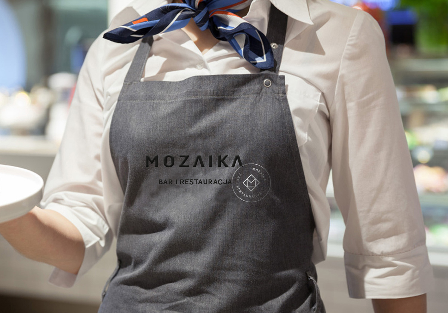
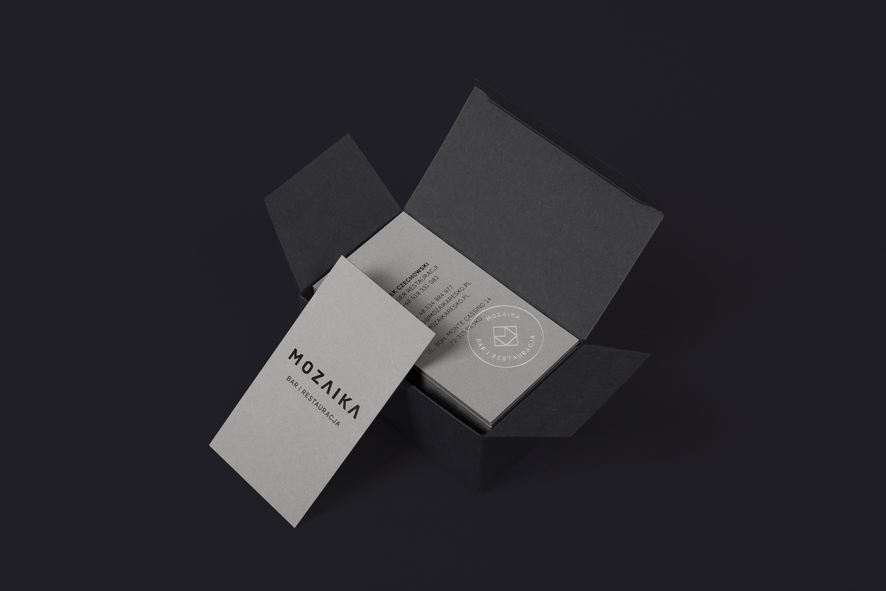
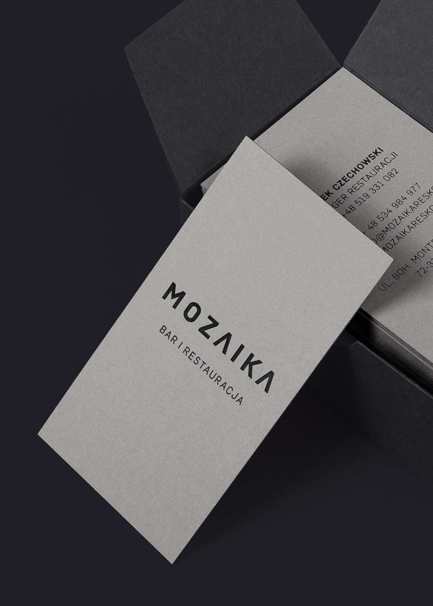
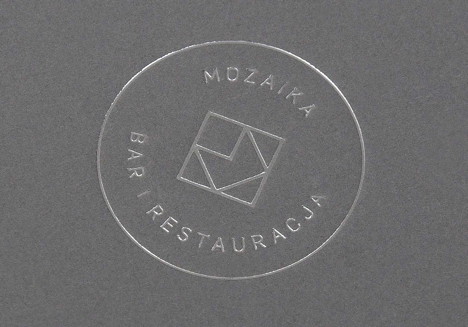
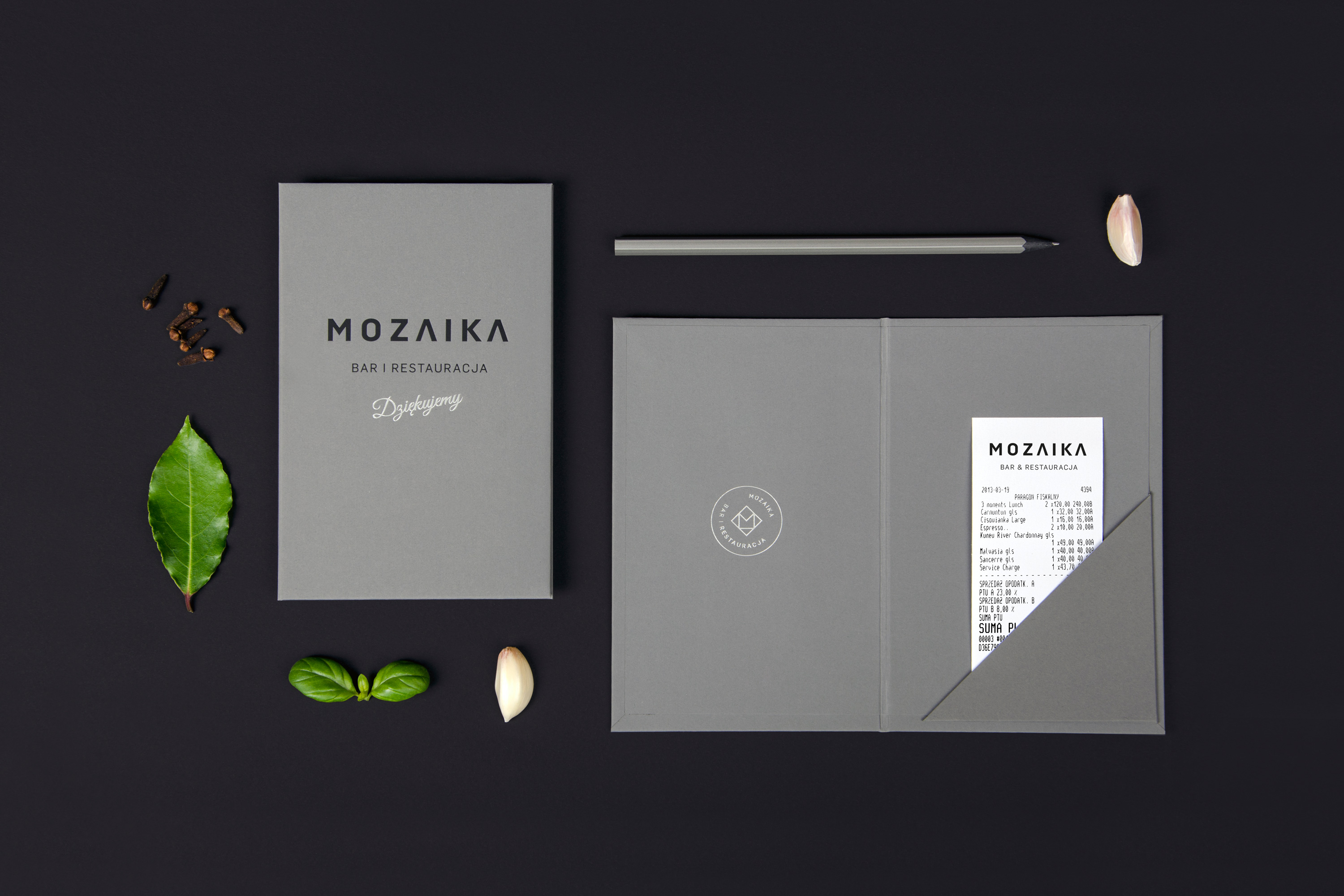
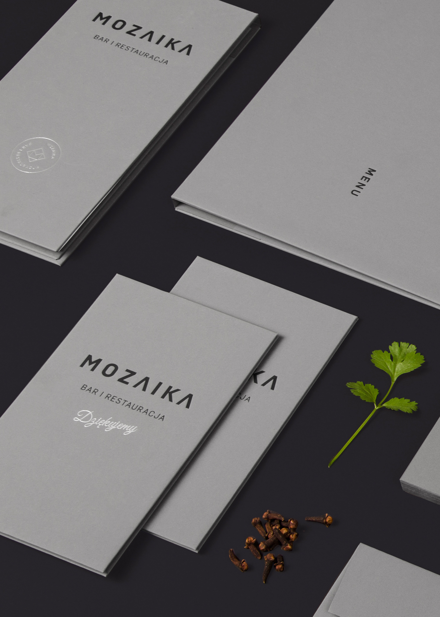
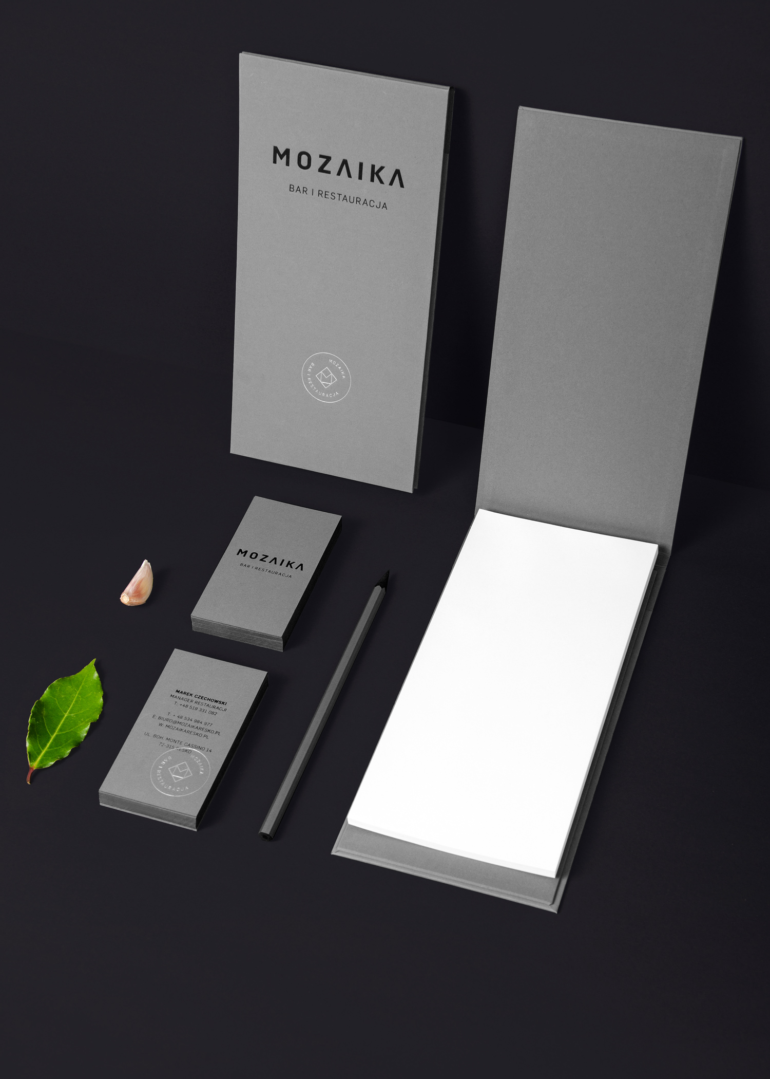
The project started with the revitalization of the restaurant changes symbolism. We created a simple and clear logotype and geometric sign - the letter "M", which closed in the form of a stamp.
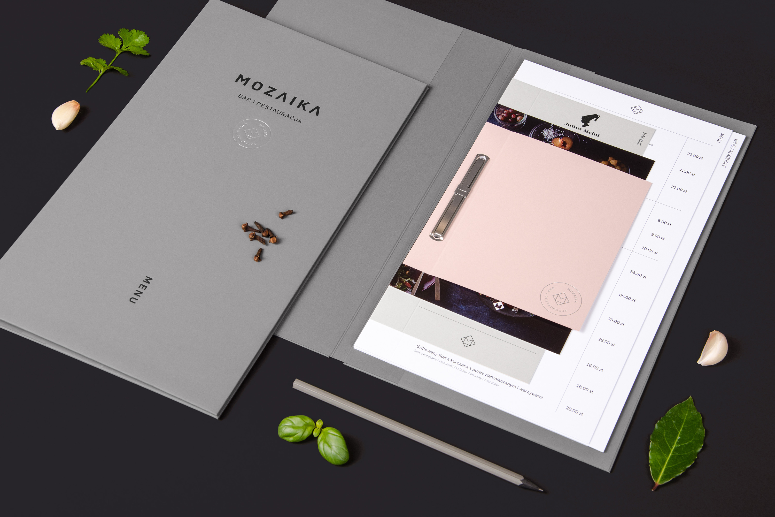
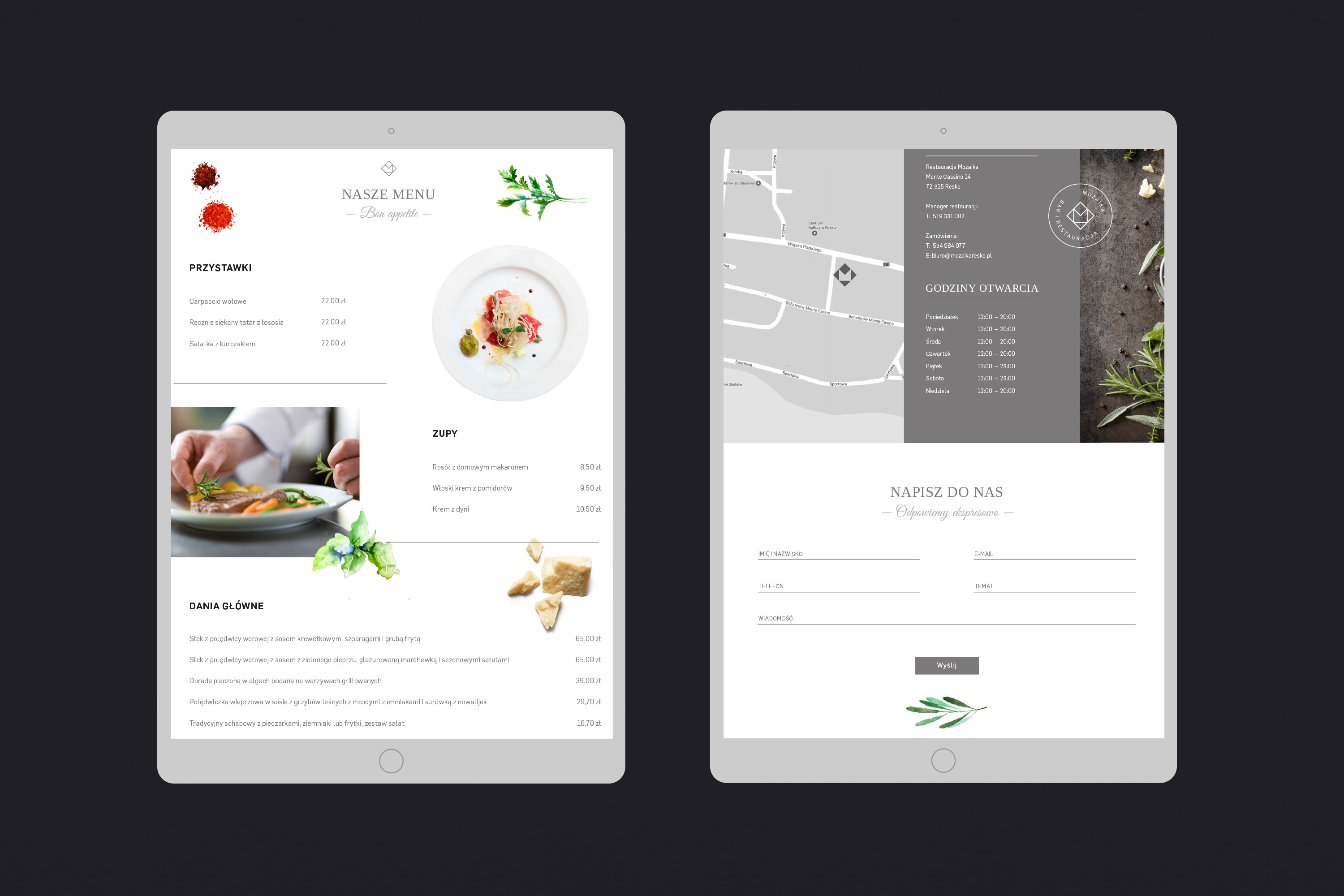
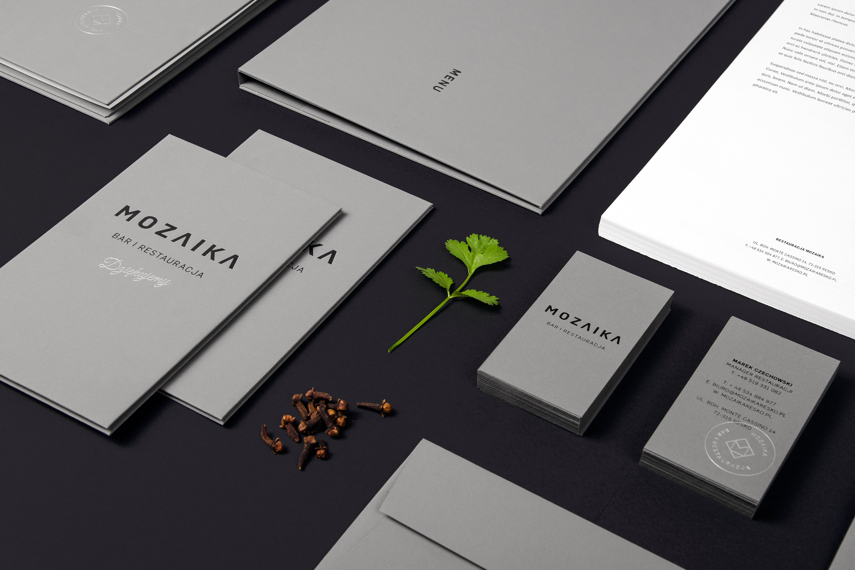
# menu
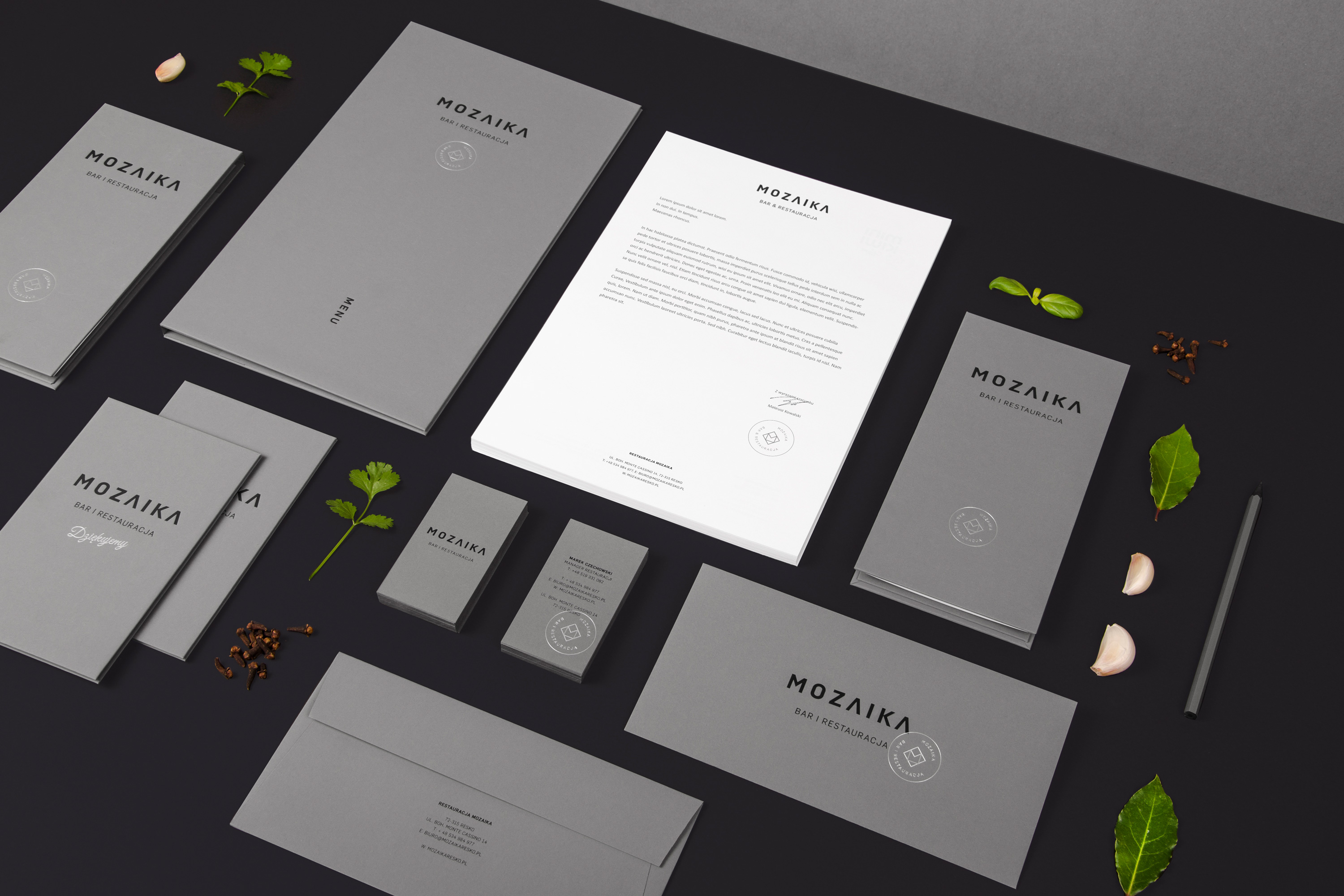
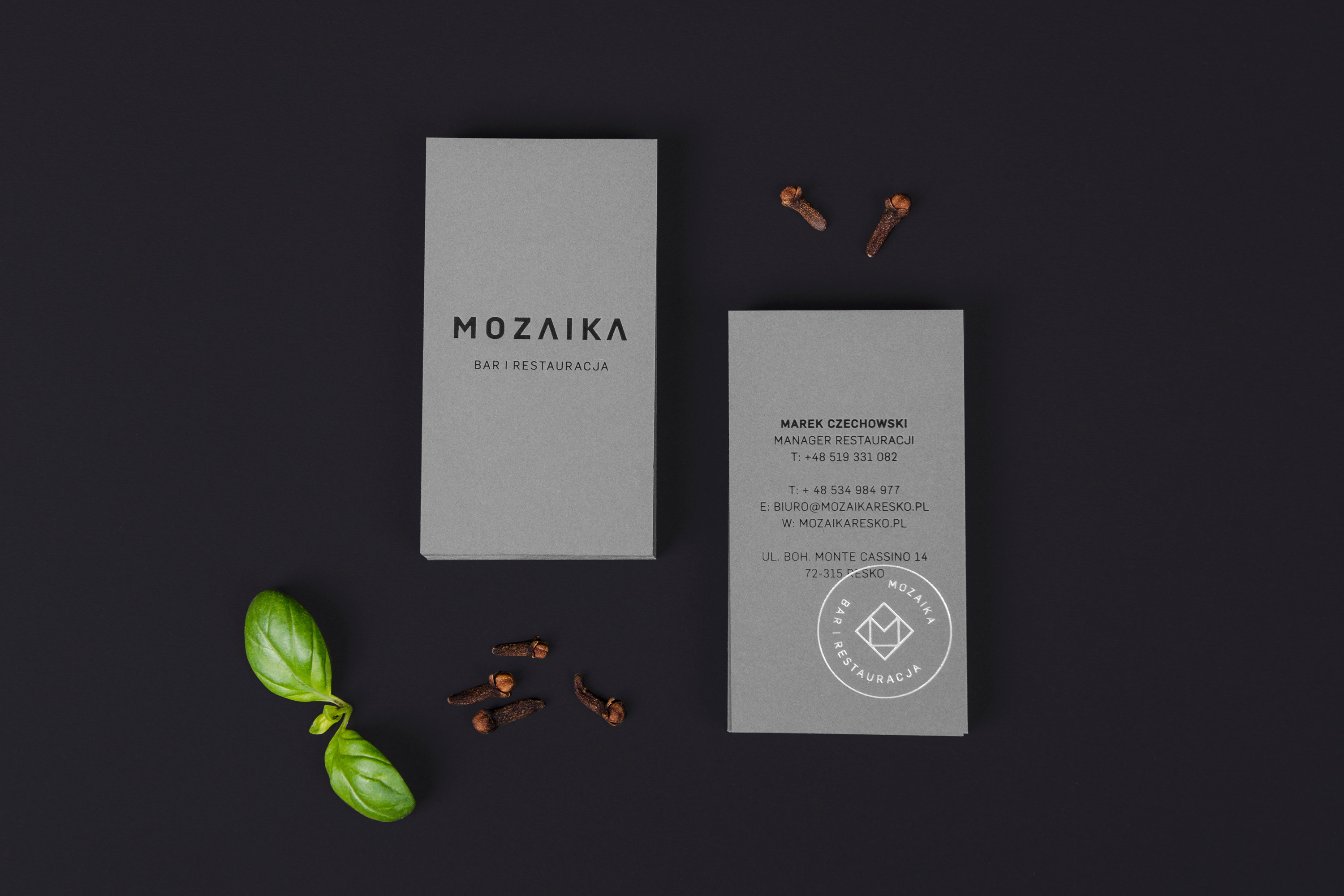
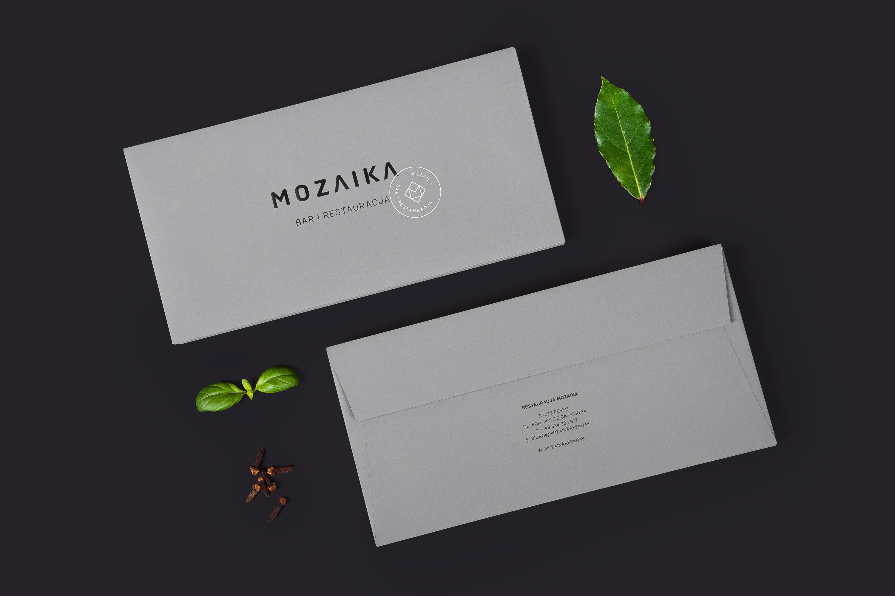
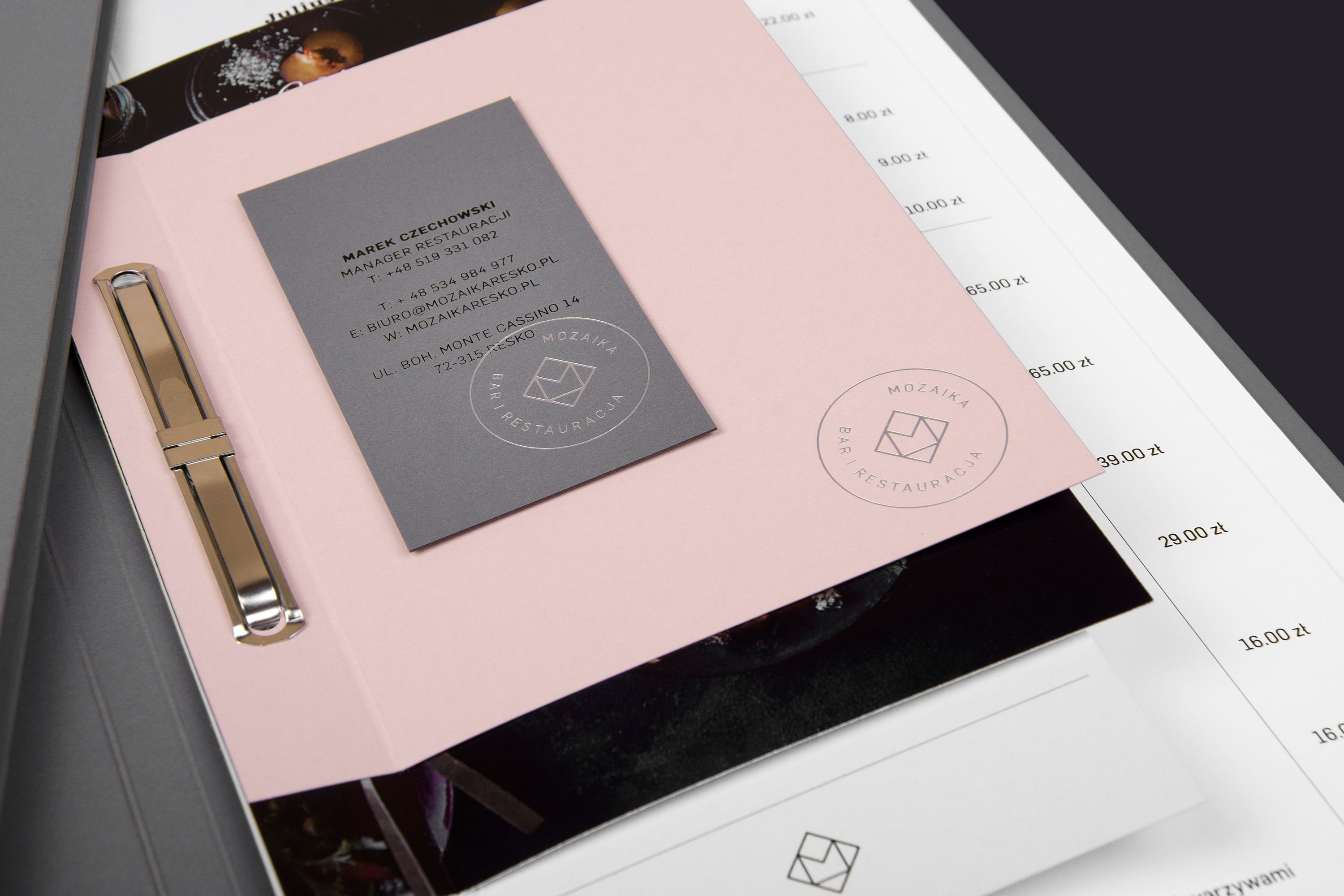
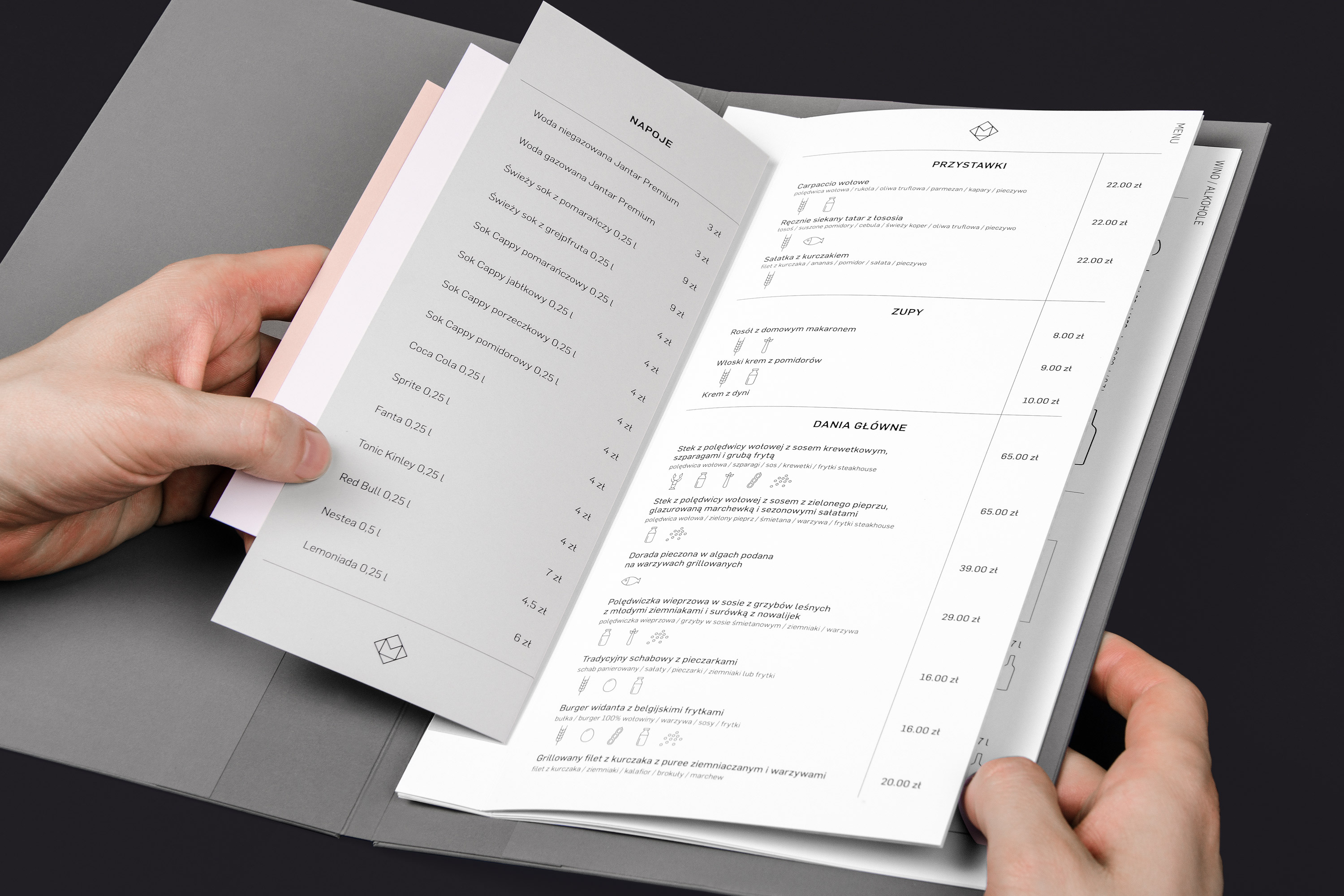
Stationery prints were made on Tube graphite colored paper (europapier.pl). Elegant matt surface and velvety to the touch materials supplemented black and silver embossing. The menu offer in the form of single pages of a binder has been fastened with a metal clip.
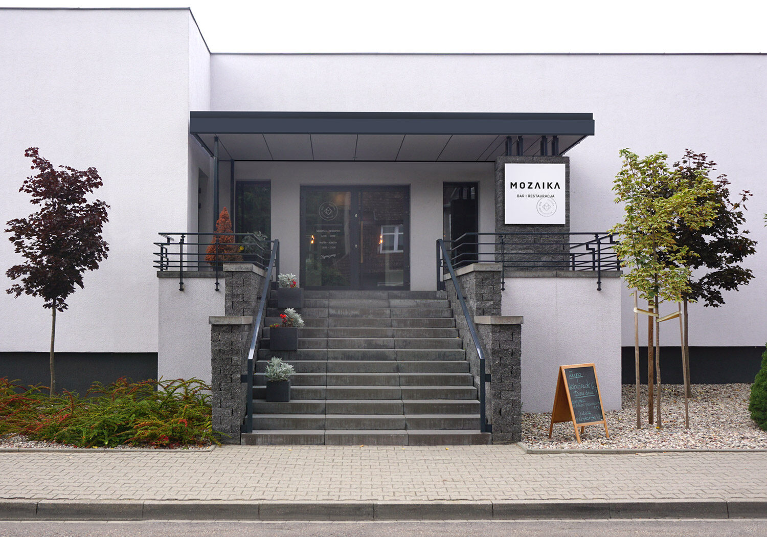
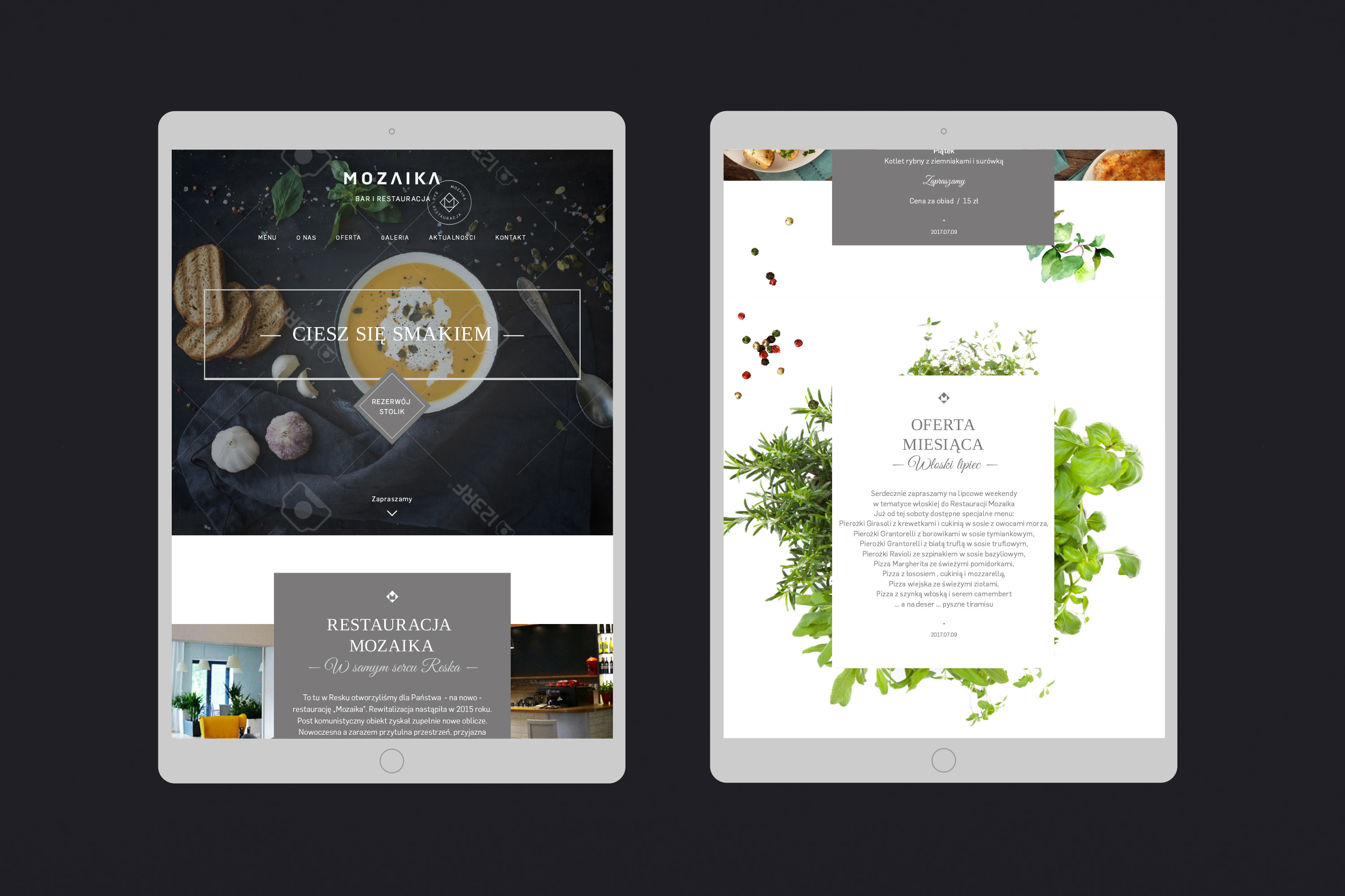
# outdoor / webdesign
We also took care of visual information and promotion of restaurants in the web space and outdoor.